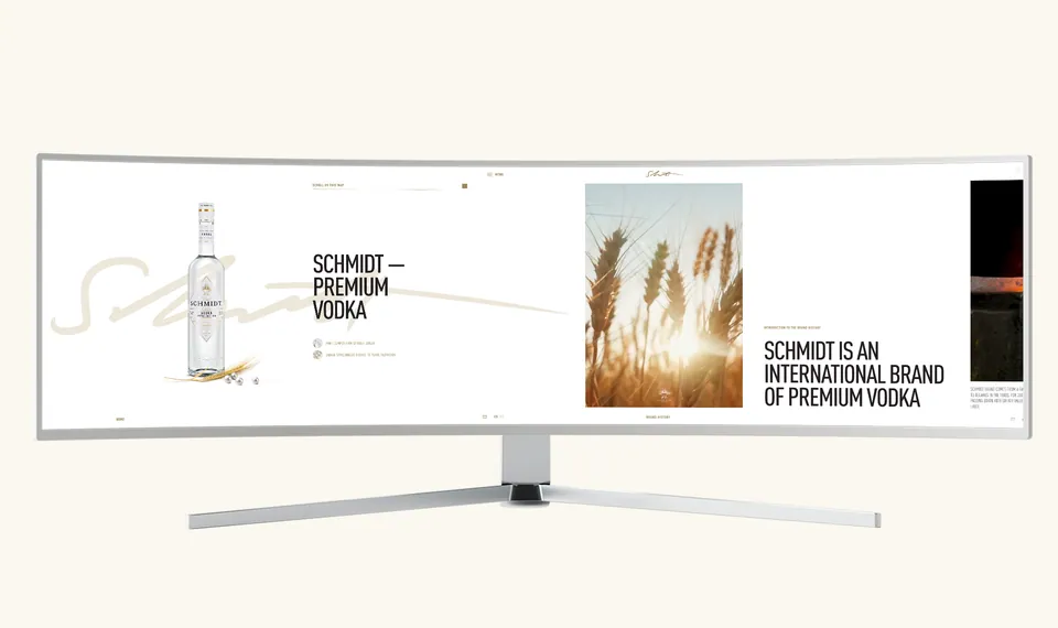
SCHMIDT,We unfolded a brand with two centuries of history into one continuous horizontal composition.
A brand story
in a horizontal rhythm.
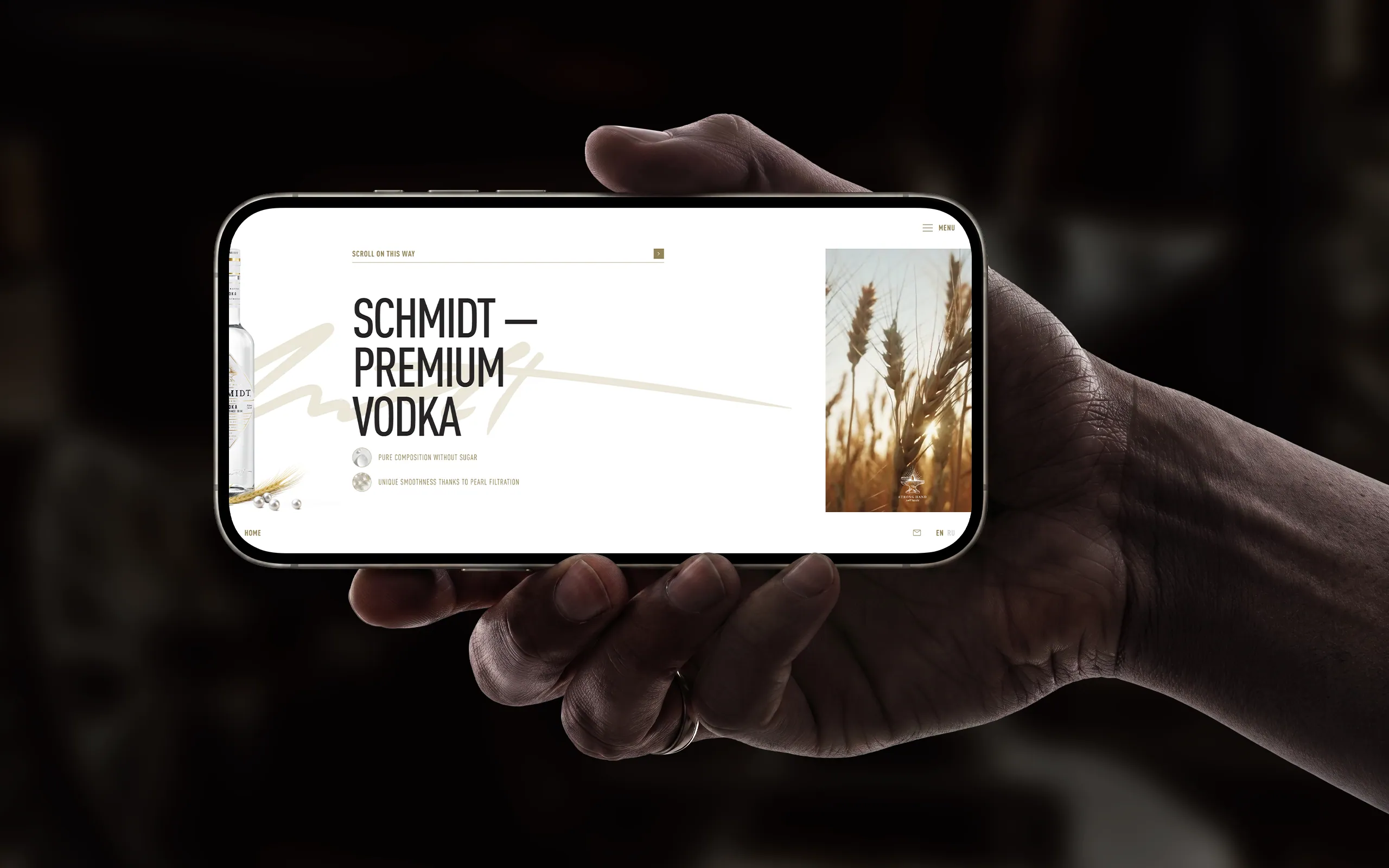
Instead of the familiar downward movement, users travel through the SCHMIDT website from left to right. Identity, editorial blocks and interface scenes become one continuous sequence.
The horizontal route sets the pace of discovery and turns the landing page into a continuous trajectory. It is not an effect for effect's sake.
composition.
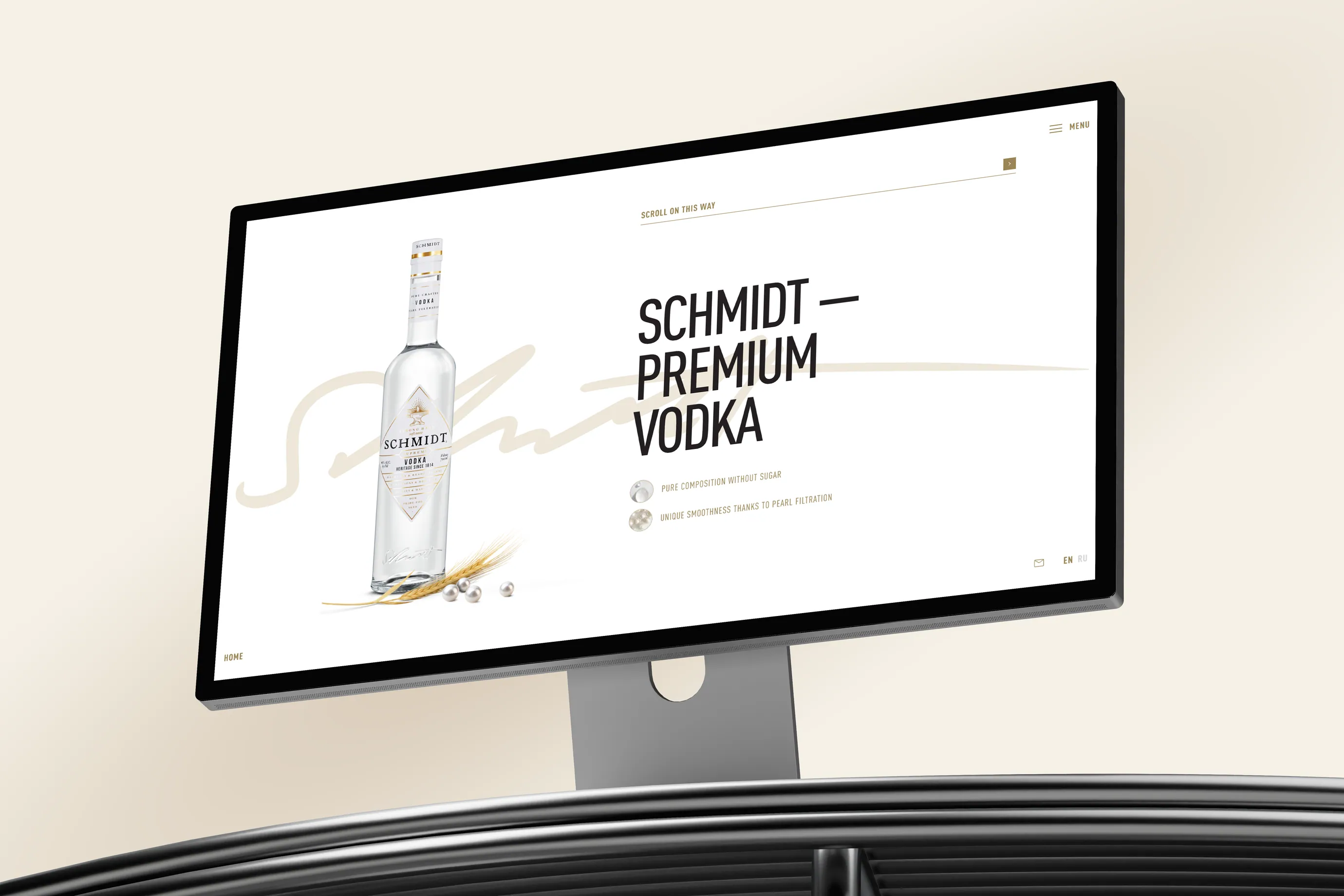
Clear glass, grain, pearls and a fine golden line shape the website's object language. Contrasting objects connect individual screens into one visual system.
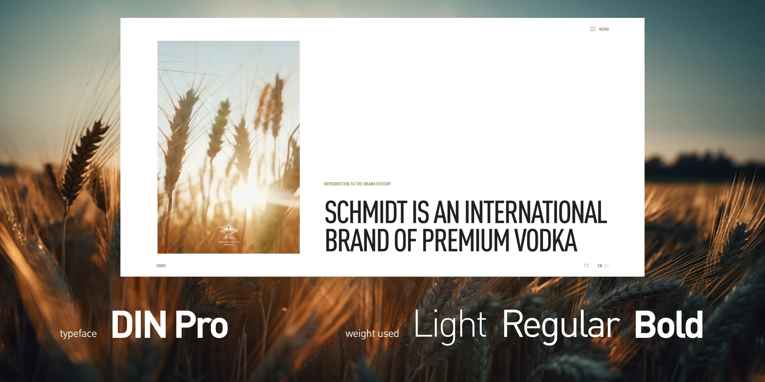
Large typography and white space keep the composition clear and composed without making it sterile.
The brand story
as the next scene.
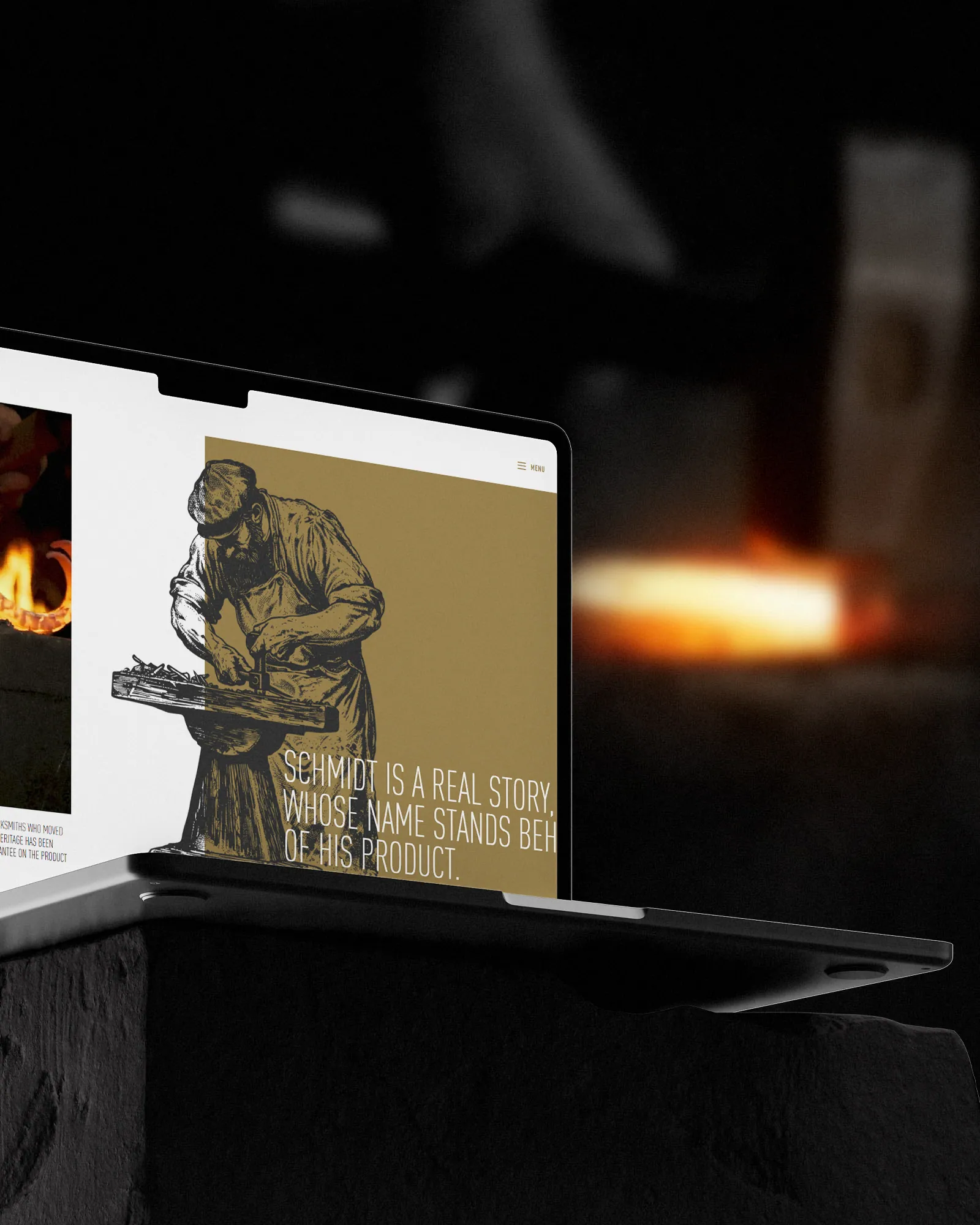
Family history, heritage and values do not sit on a separate text page. They become part of the same spatial sequence, giving each fact weight and rhythm without interrupting the movement.
Production as
a transparent process.
The section is divided into four numbered scenes. We developed a distinct object image for each while preserving shared rules for grid, typography and motion.




Four distinct images become one continuous visual journey.
through distinct journeys.
Every product receives its own screen with an individual composition, colour accent and arrangement of content.
Shared grid and typographic rules hold the sections together, while varied layouts prevent mechanical repetition.
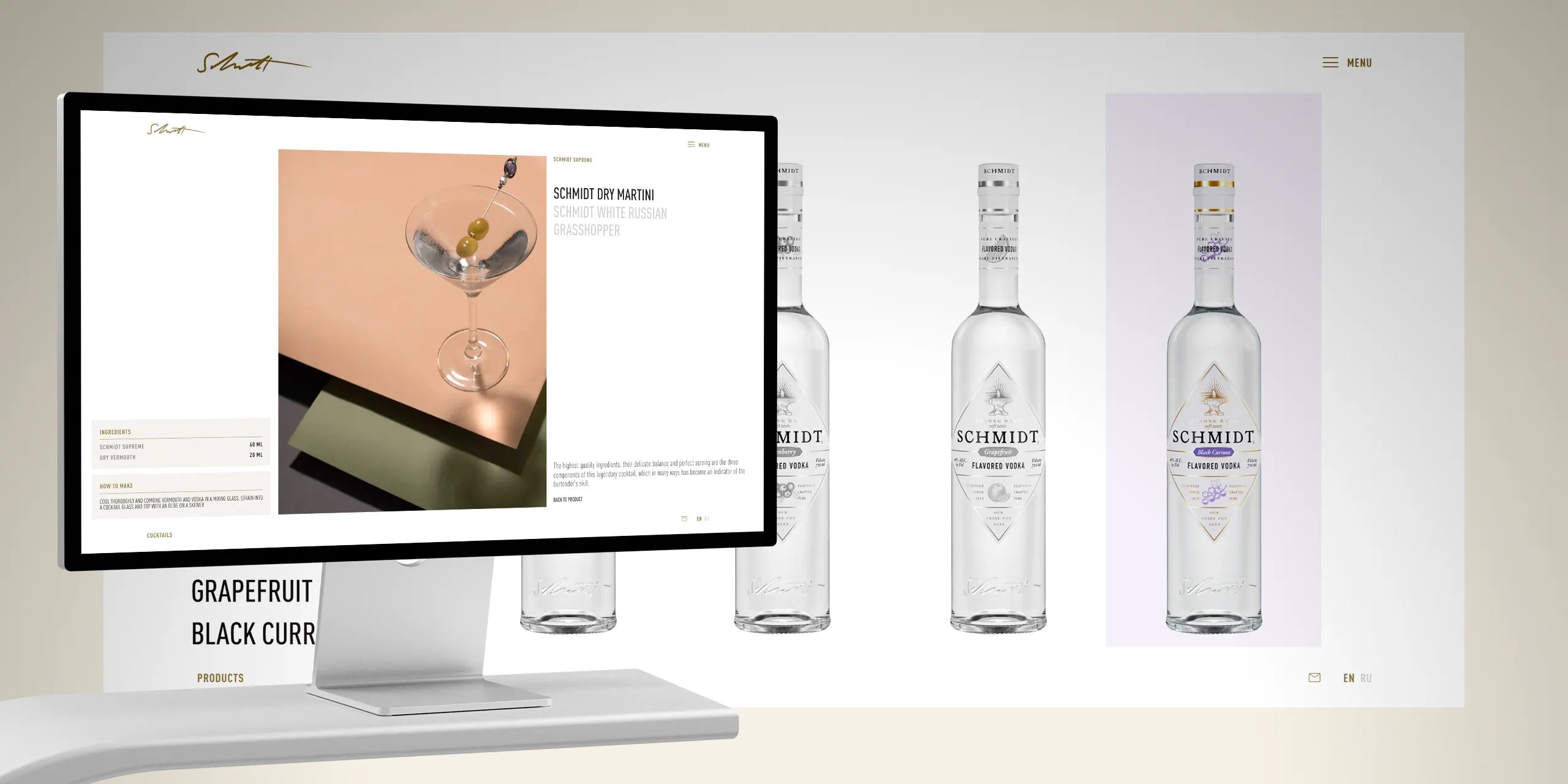
Different screens.
On a wide screen, the story unfolds as a long horizontal composition. On narrow screens, the order of scenes remains while guidance becomes more explicit.
Responsive design is judged not by shrinking blocks, but by preserving the same rhythm of discovering the brand.
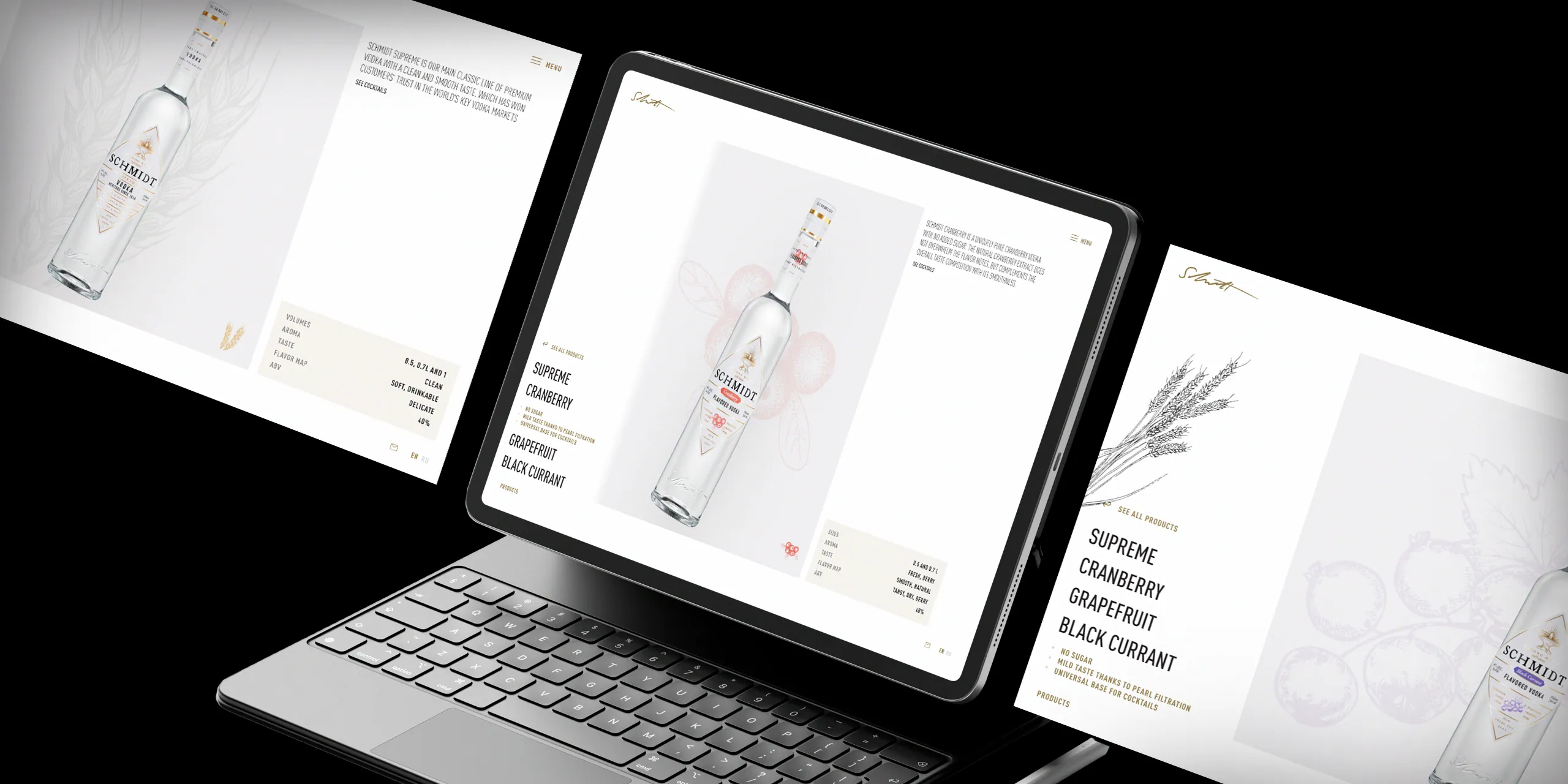
For SCHMIDT, we created a distinctive website with unified art direction, a horizontal rhythm and interactive animation. Grid, typography and object imagery connect every section in a coherent digital brand story.